logo creation + selection
/WHAT IS A LOGO ANYWAYS?
Logo: is a graphic mark, emblem, or symbol commonly used by commercial enterprises, organizations, and even individuals to aid and promote instant public recognition. (wikipedia)
REMEMBER, YOUR LOGO IS NOT YOUR BRAND.
Your logo is a representation and first impression your brand.
You’re going to want to pull out your inspiration board and your brand board for the task of selecting and creating a logo. If you missed the posts on how to establish your brand and create a brand board, go here. If you’re looking for a quick way to create a brand board, find my quick, non-designer tutorial here.
Logos are funny things. Sometimes, the simplest logos have the most impact. Think of Nike (swoosh) and Target (bullseye). Depending on what you want to communicate about your brand, this may prove to be very useful advice.
Some logos are the company name and nothing else. With the right font and color, this may be exactly what a brand needs. This is something you’ll need to consider for your brand.
choices, choices, choices /
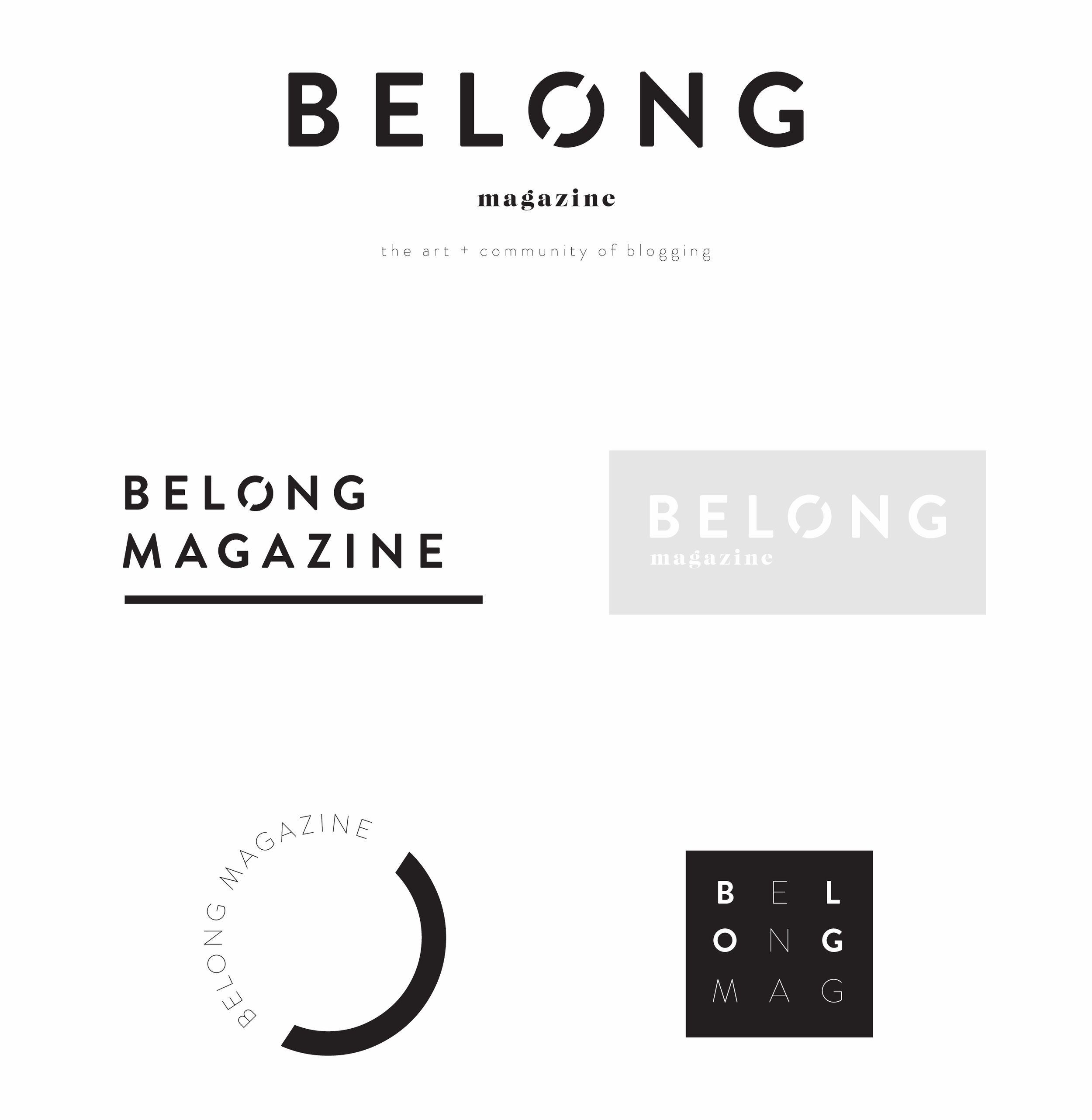
Whether you have a designer create it or you do it yourself, it’s always a good idea to put together a few variations to choose from.
Generally, the choies all stem from one main idea, but they take a slightly different shape or form. And you might even have variations of your final logo. Look at what we have for Belong:
logo considerations
KEEP IT SIMPLE /
The more you have going on in your logo, the more confused a potential client/customer will be. Flourishes might seem fancy and nice, but they are very distracting and can start to look messy.
BLACK + WHITE /
Keep in mind that, at some point, your logo is most likely going to need to be used in a black and white form. Be sure that it can easily be translated into black and white without losing its essence.
CONSIDER YOUR CLIENT OR CUSTOMER /
Keep your new imaginary biz BFF in mind—what would he/she like? (did you miss my imaginary BFF post? Read it here.) Try to put yourself in his/her shoes and evaluate what the response would be and if that is truly what you want?
ASK /
I love it when people post potential logos in facebook biz groups. It’s such a great way to offer concrete and helpful advice. Just remember to BE NICE! If you aren’t part of a facebook group like this, feel free to join The Belong Collective. OR, you could ask family, friends or potential customers as well.
my favorite logos and why I like them /

BP / I have always loved this logo. The color, the shape and the overall look--it's precise and pretty.
SCHOOLHOUSE ELECTRIC / This is perfectly representative of the company--clean, basic with a flair of retro in that swirly icon image.
SQUARESPACE / I love the way they play on the "S" shapes to sort of make a square at an angle. The basic font is representative of the platform and how it functions.
WHITESPACE MAGAZINE / This one literally speaks for itself! The way the "W" is missing lines is directly related to the name. And the light color is breathable.
What are some of your favorite logos? Or, maybe share your logo. Need advice? Ask in our facebook group, The Belong Collective.
you'll also love /


join us on instagram /