color me pretty / how color shapes your brand
/Color is huge when it comes to your branding. I am not a professional designer, but I'm sharing my personal experience as I've navigated this whole brand game.
Remember that in inspiration board you created? (if you missed this post, you can read about it here) We are going to put it to use in creating your brand. And the first way we’re going to do that is by evaluating what color(s) are used most prominently on your board.
how many?
How many colors are acceptable? REALLY. Most designers will tell you to choose up to three main colors and no more than three secondary colors. For example, Belong’s main colors are black and white and our secondary colors are bright pink, bright green and bright yellow. (that's a lot of "bright"--maybe I should come up with something a little more creative like flamingo, kelly and sunshine?!)
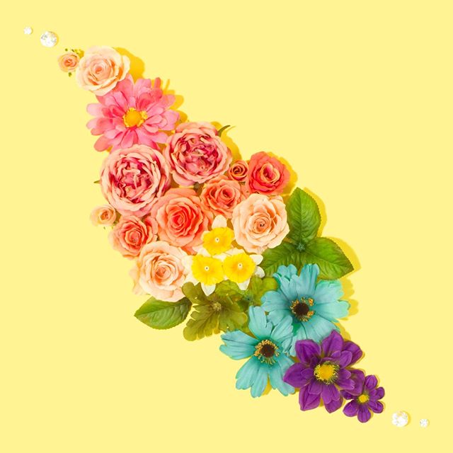
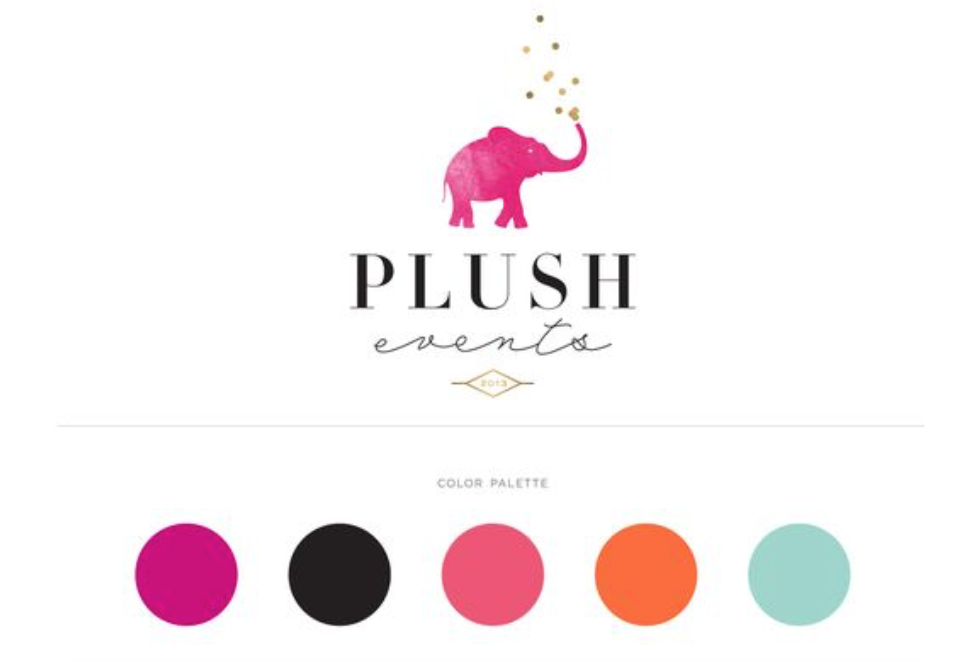
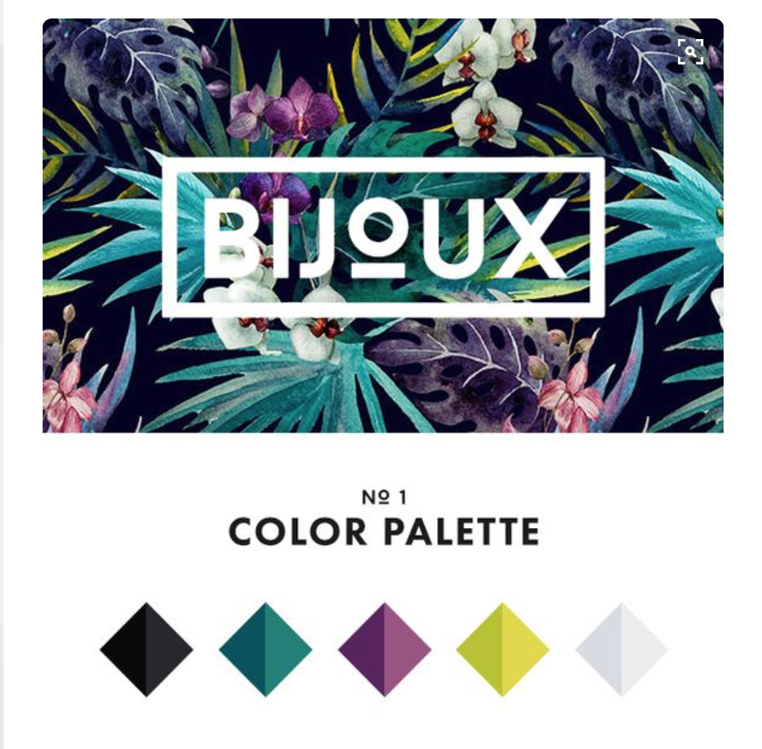
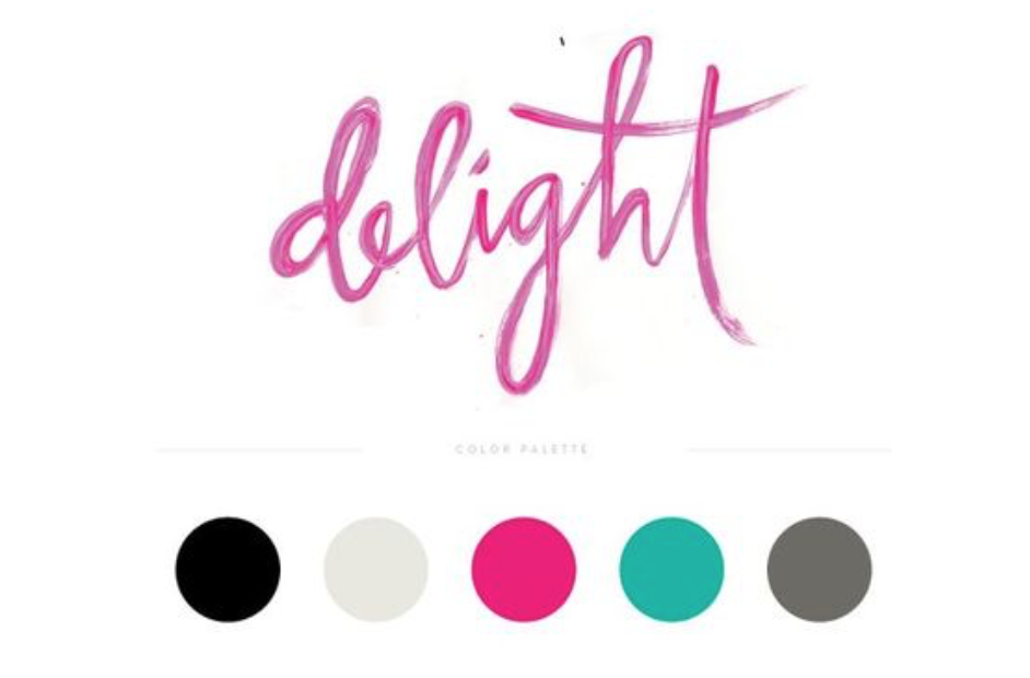
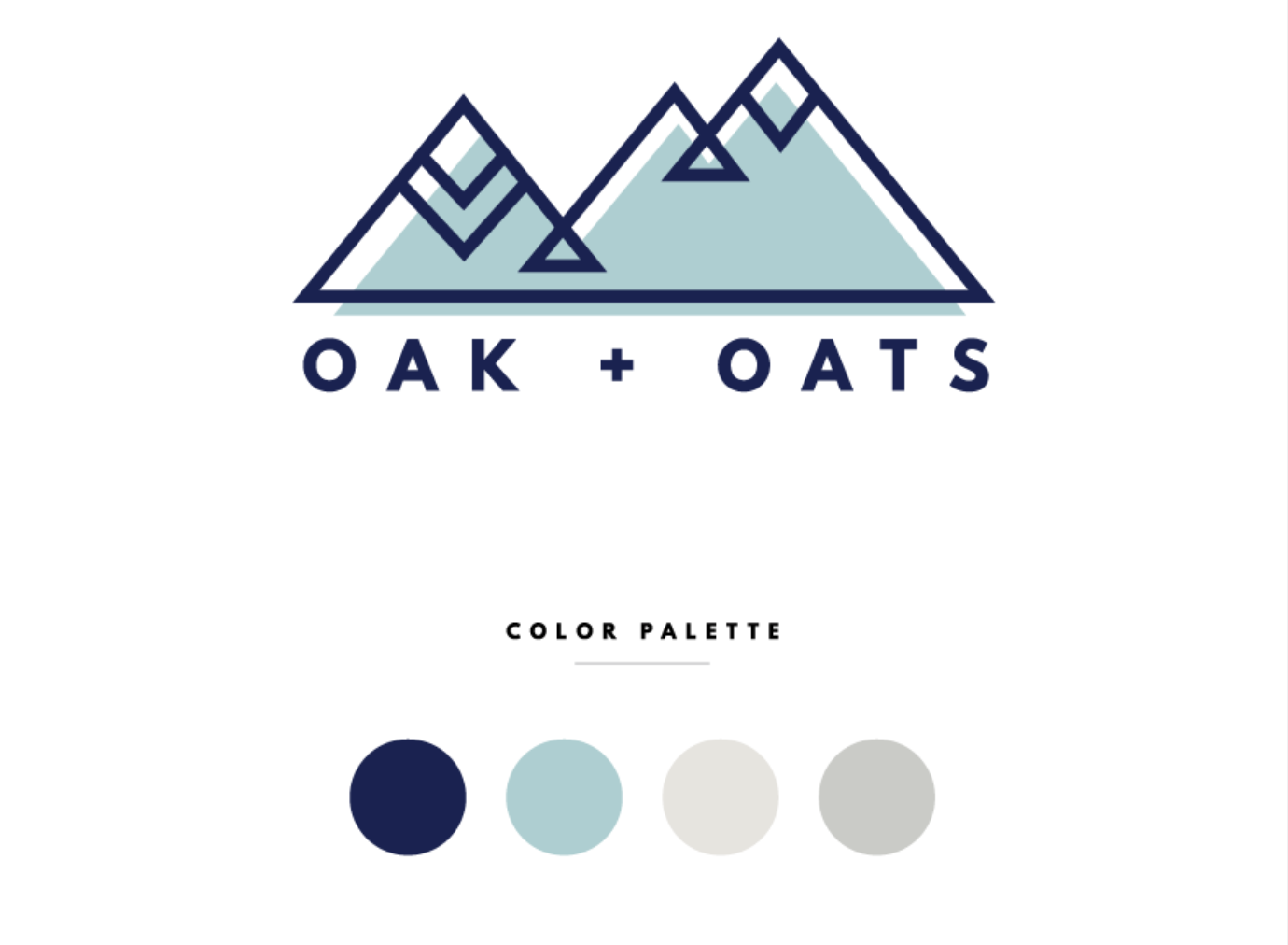
Some other examples of this are… (all from pinterest).
color theory /
Take those colors and look up (ie google) their meaning—for example, yellow is happy—and ask yourself if that is what you want your business to reflect. If not, you may want to go back and do some revisions on your inspiration board. Keep in mind that colors can mean different things depending on the culture, situation and industry.

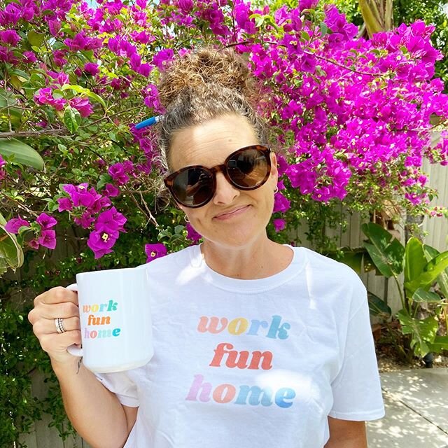
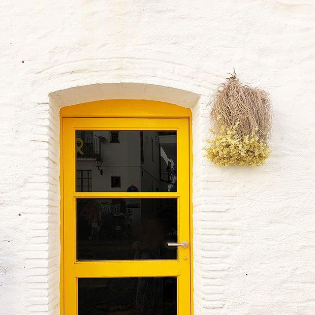
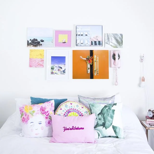
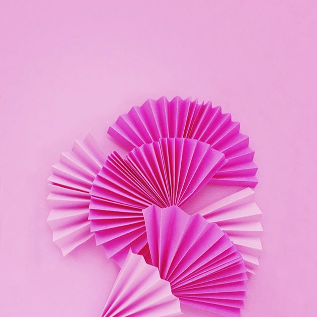
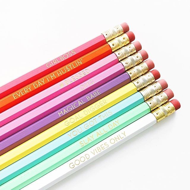
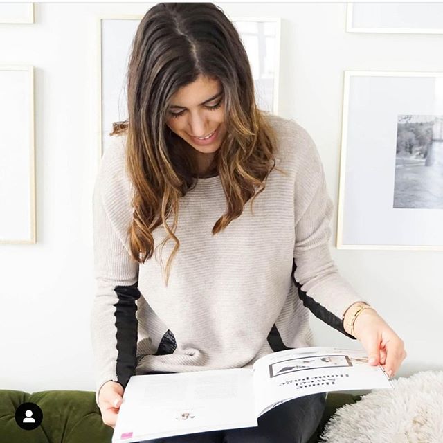
Can you feel it?
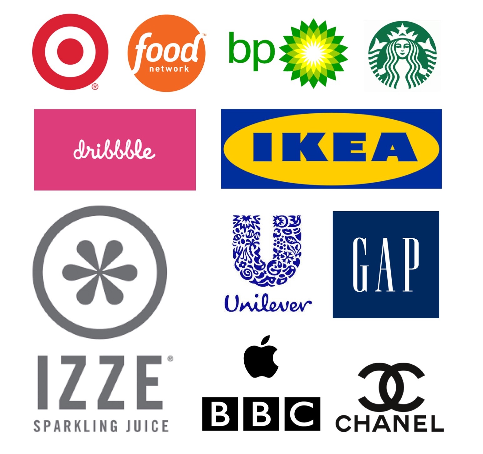
Here are some examples of brands that are using color to shape their customer's experience. What do you think?
let's get technical /
You've chosen your colors, you know what they mean and how they make people feel. Now, how do you make them a reality--AND CONSISTENT--in all forms of your communication. There are several types of color systems you'll want to know about--for print and on-screen.
CMYK / 4-Color Process Printing: this is referring to the four colors that are combined to make up your chosen color. C=cyan, M=magenta, Y=yellow and K=black. (Files you can use with this process are .eps, .pdf and .tif.)
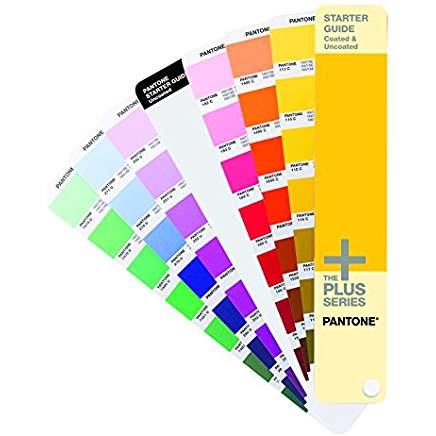
SPOT COLOR / Pre-Mixed Inks: The Pantone Matching System is a color numbering and swatch system that allows you to match colors exactly while insuring consistency. (Files you can use with this process are .eps and .pdf.)
RGB / Additive Color Mix: these colors are made by mixing various different amounts of Red, Green and Blue light on a screen. Some will not convert accurately to CMYK or Spot Color and literally cannot be printed. (Files you can use with this process are .png, .jpg, .gif, .svg.)
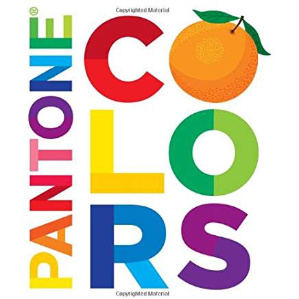
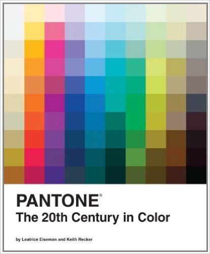
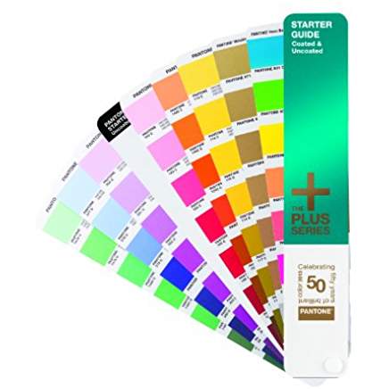
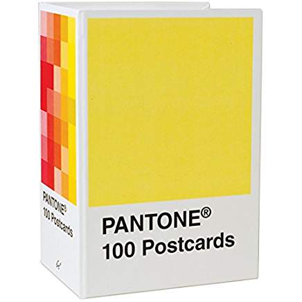
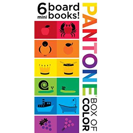
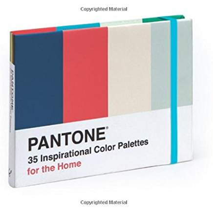
If this sounds like another language to you, don't worry. If you have colors that really stick out to you that you just love and want to replicate, use the Pantone Studio app to help you determine the exact colors for you instead of having to do it yourself. It might even be fun! Or, if you don't want to buy the BIG (expensive!) swatch book(s), you can find some fun alternatives below.
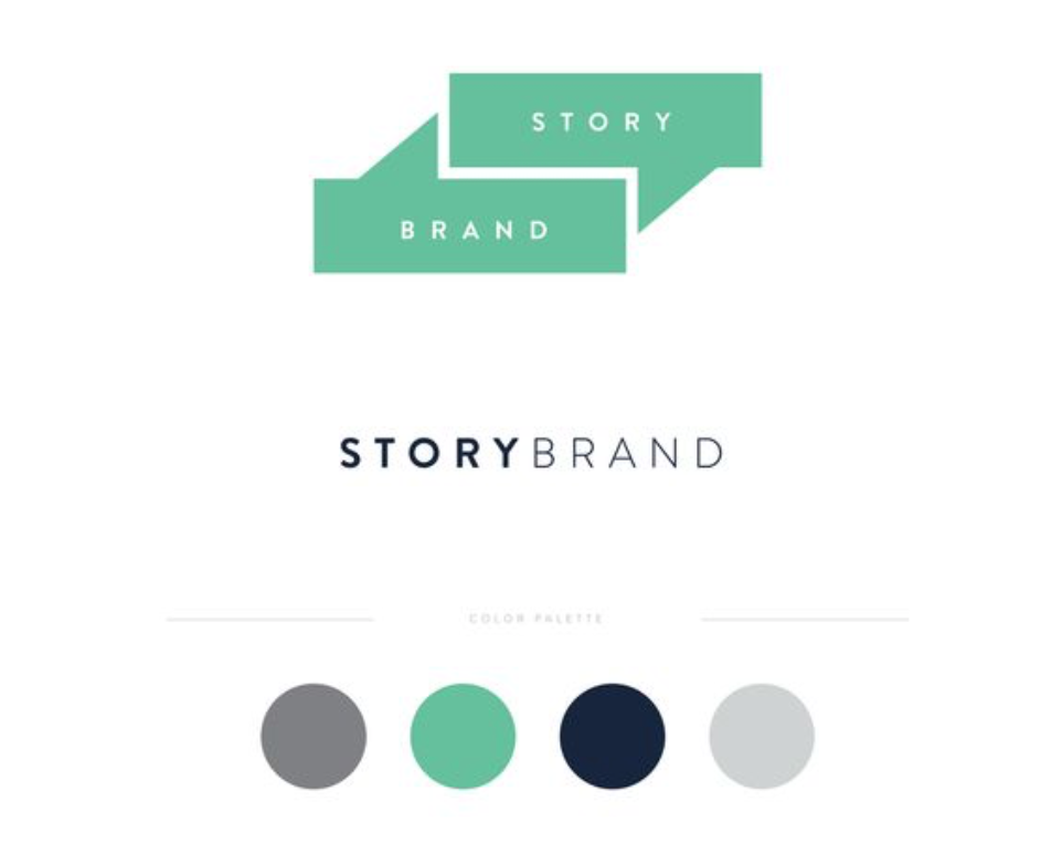
I love seeing the different color schemes that new brands come up with--not only the schemes, but the ways in which they use them to evoke certain emotions or connotations. What are some of your favorite combinations?
Next up on the non-designers guide to branding is all about fonts! Click below to stay in the loop so you don't miss a post!
other posts you'll love /


join us on instagram /